Stories Design note
Sample: One home screen, one remote
SAMPLE POST. Shows every part of a story: headings, a list, a quote, a picture with a caption. Replace or delete it before launch.
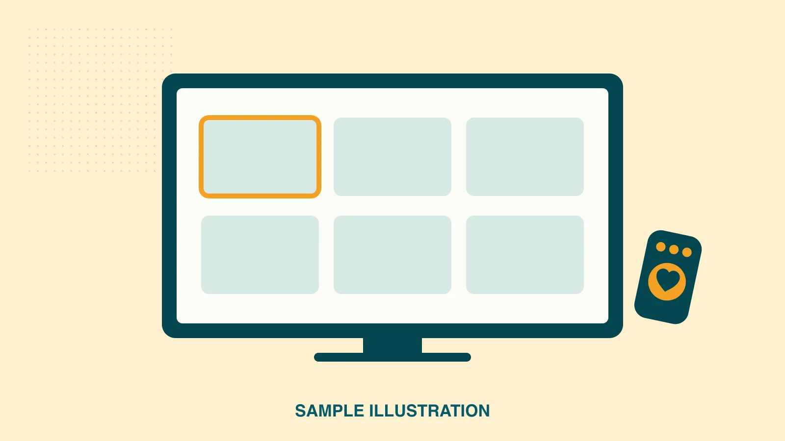
This is a sample story. It exists to show how a post looks. Delete it, or set it to Draft, before the site goes live.
Every story starts with a snag at home. This one: watching the evening news meant choosing between three remotes, then finding the right input, then the right app. Each step was one more place to get stuck.
What we noticed
The hard part was never the show. It was everything between switching the TV on and the show starting.
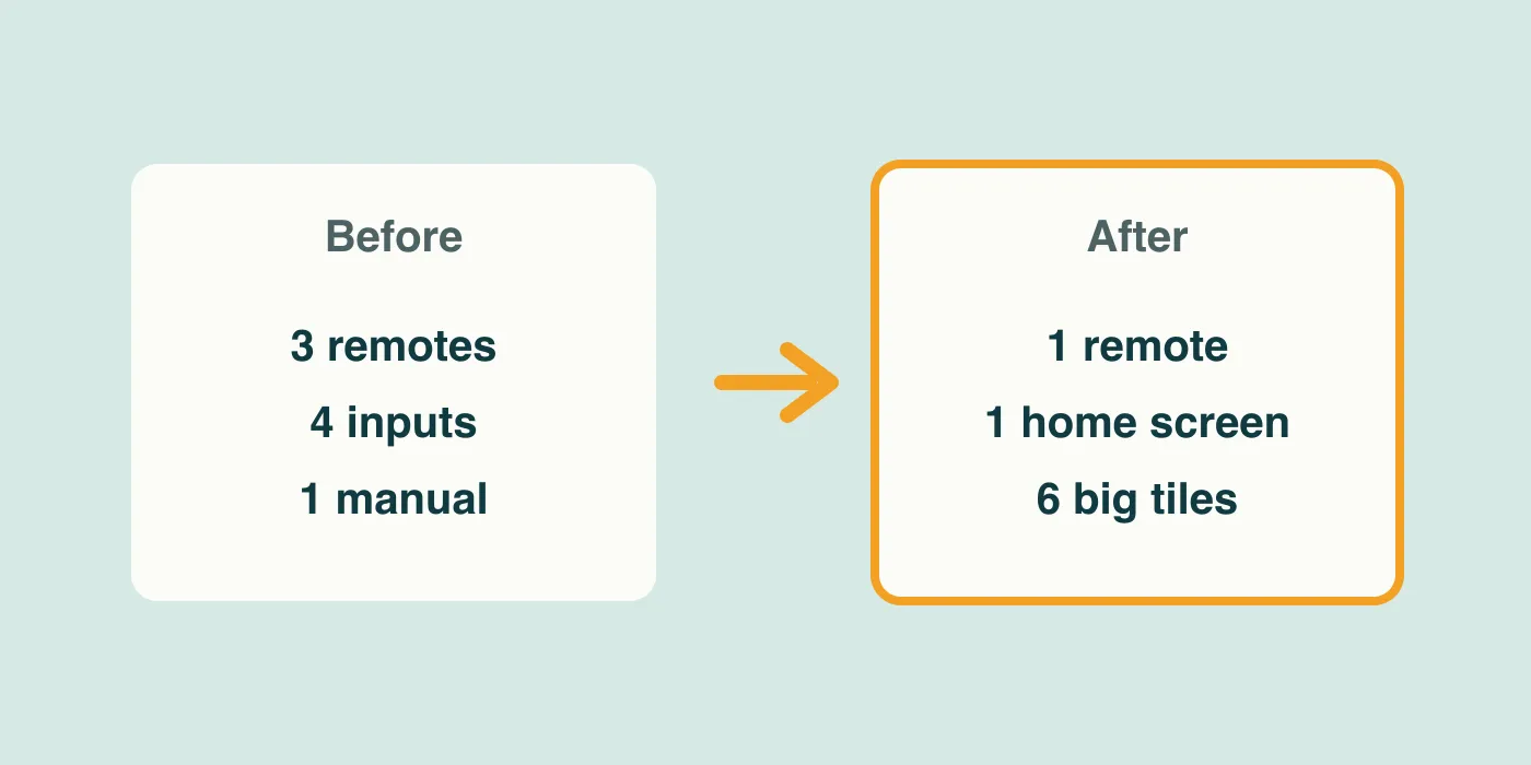
- Three remotes, each with over forty buttons
- Four inputs, named in ways nobody remembers
- An app layout that changed after every update
What we made
A single home screen with six big tiles. The ordinary TV remote moves between them, and the one you are on wears a thick amber outline so it is obvious from across the room.
The best compliment so far: “I didn’t have to think about it.”
Why six tiles
Six fit on screen at a size readable from the sofa, and six covers everything watched in a normal week. More tiles meant smaller text and more choices; fewer meant hunting in menus again.
What we would change
We would have tested with the room lights on sooner. Glare hid the outline on one TV, so we made it thicker.