Stories Design note
Part of BoomerOS for TV
Beyond big buttons: a better TV remote for seniors
Remotes for seniors are the old remote with bigger buttons. How I'm designing a better one for my dad: lit keys beside a small screen, like an ATM.
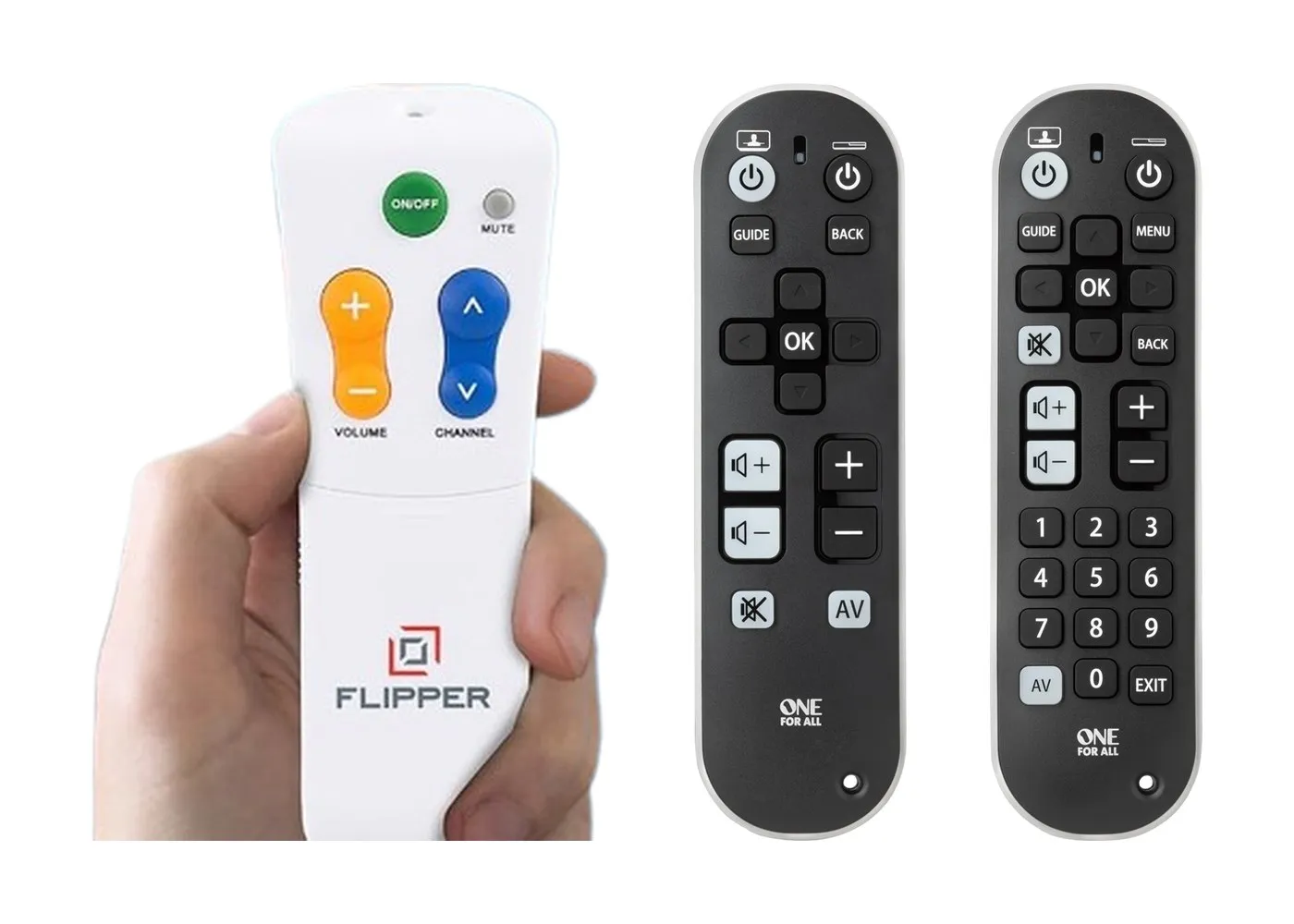
The TV remotes sold for older people are mostly the remote we all grew up with, made bigger. Fewer buttons, larger keys, sometimes a number pad you can read from across the room.
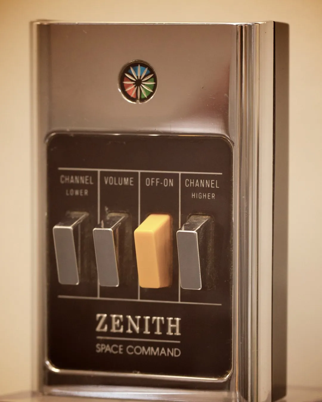
The idea is old. Zenith's first wireless remote, in 1956, did four things: channel up, channel down, sound on and off, and power.1 That was enough when TV meant a handful of channels.
Flipper, a remote sold for seniors today, has six buttons for much the same jobs, and doesn't work with streaming boxes like Roku or Apple TV.2 My dad's TV has hundreds of channels, more than one input and a row of apps, and a bigger button doesn't tell him which channel the game is on. And if he can't remember the number, a big number pad is no help.
Finding it through the menus isn't easy either. My dad has mild Parkinson's, and steering a highlight around a menu with arrow keys is hard with a tremor. What I want is for him to get to what he wants to watch directly, without typing channel numbers or hunting through menus. That's the idea behind BoomerOS for TV, the simpler screen my friend Eric and I are building to sit in front of the TV's own menus.
This post is about the remote for that screen: where the idea came from, how its design changed as the TV's screens changed, and the plan we ended up with. It starts with the remote we already had.
Our web remote skips the guide
Eric and I already built one remote. It's a web remote: it runs in the browser on a phone, a tablet or a computer. The first version, in late September, put my dad's favourite channels on big tiles, with volume, channel and Off along the bottom.
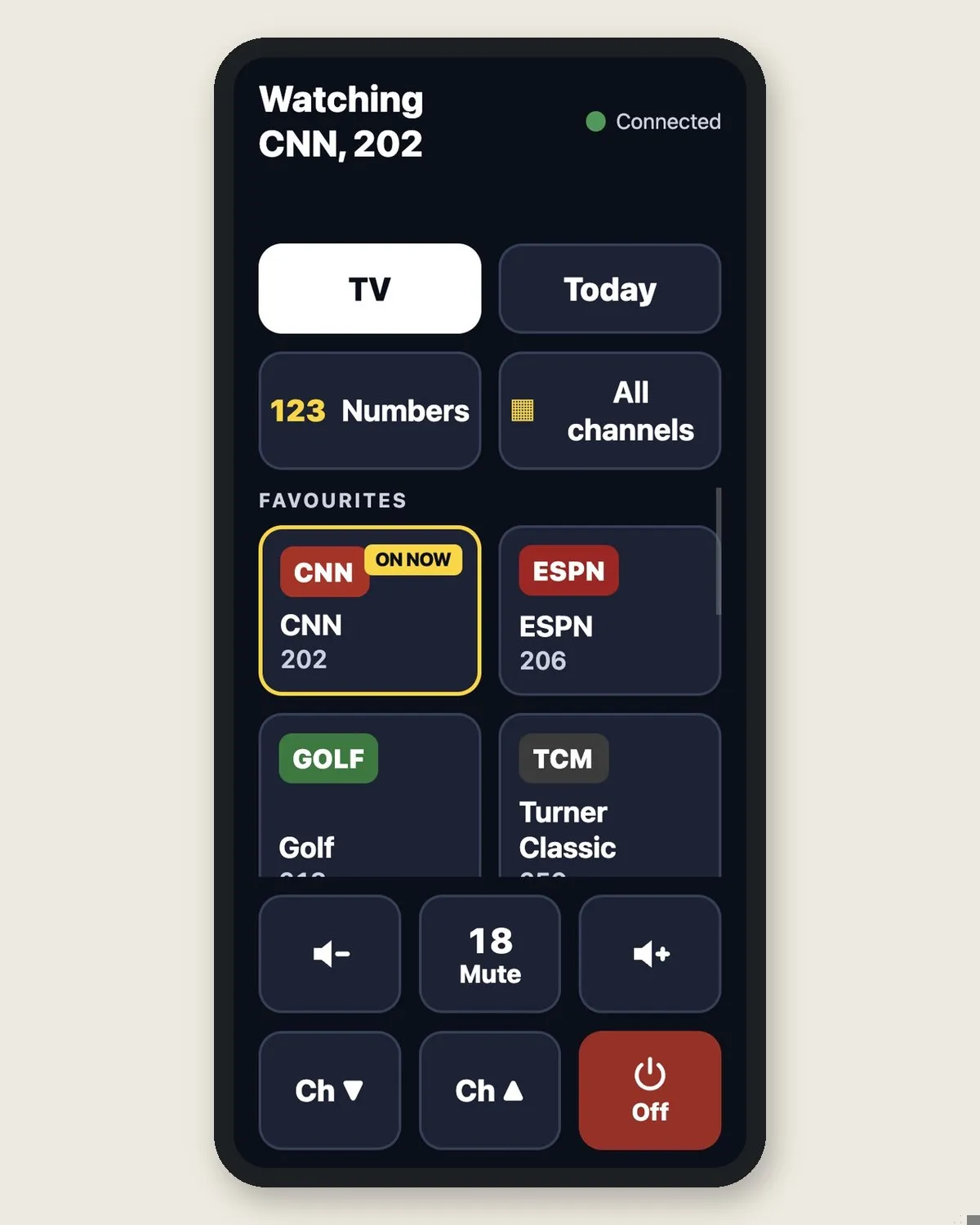
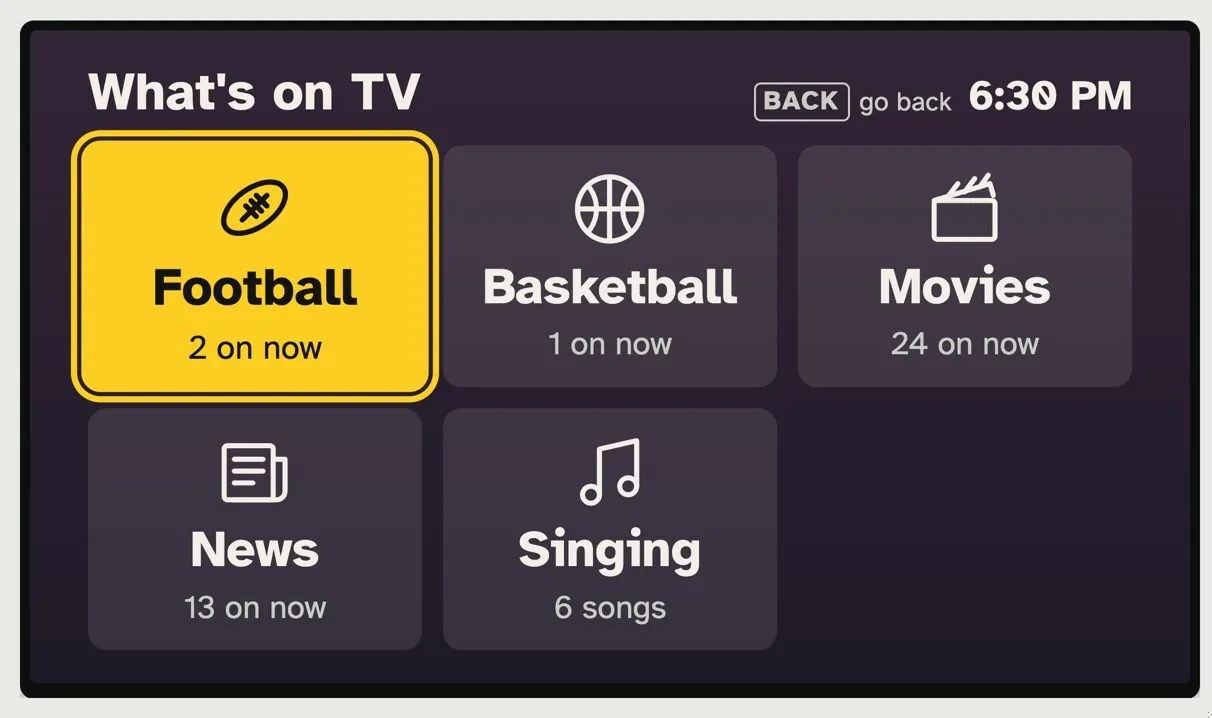
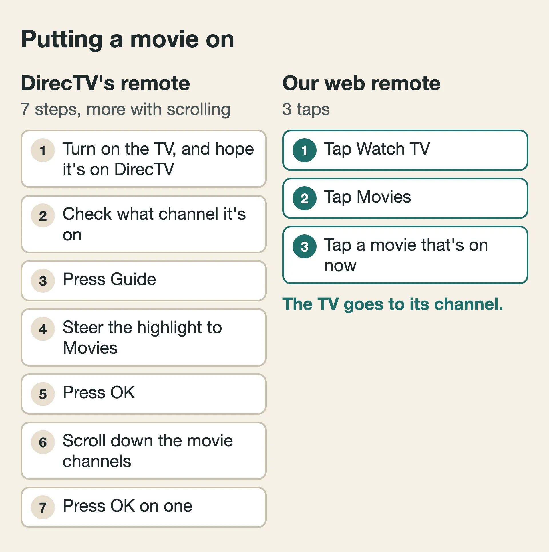
A few days later, we added a screen to the TV that shows what's on, grouped into things like movies, sports and news, instead of channel numbers. The remote showed the same choices. To put on a movie, I tap Watch TV, then Movies, and there's a list of the movies on now. I tap one, and the TV changes to its channel. I never have to type or remember a channel number.
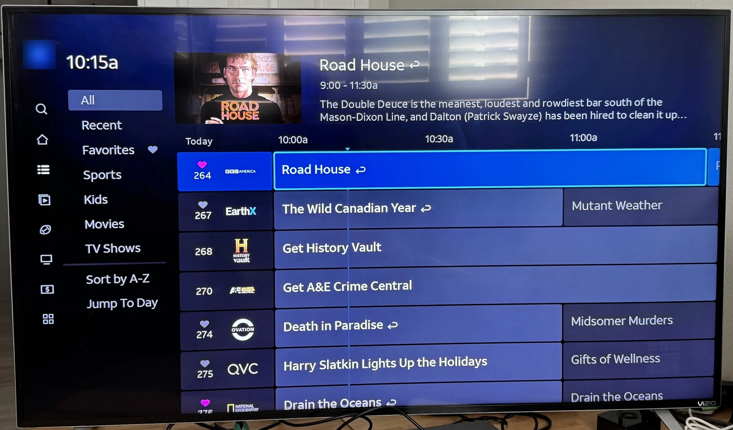
With DirecTV's own remote, finding a movie means working through the guide. The remote has more than 30 buttons, and most of them only make sense once you know where you are on the screen.
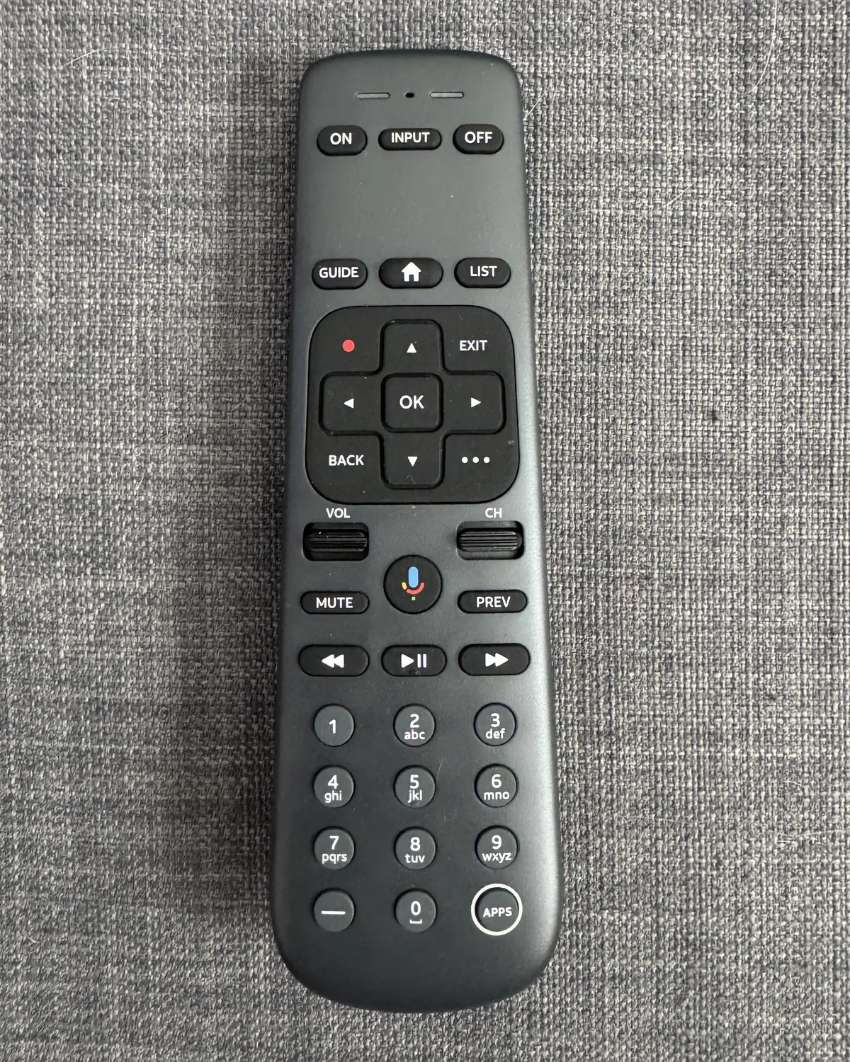
To put on a movie with it, I turn on the TV and hope it's already on the DirecTV input. I check what channel it's on and press Guide. The guide is a grid of channels by number, with what's on each, and a menu down the side. I steer the highlight over to Movies and press OK. That loads the channels showing movies, and I scroll down through them until I find one I might like. Then I press OK again.
But a phone remote is one more thing to remember
In my use, the web remote is faster, but it has a catch for my dad: he has to remember that his phone is the remote now. To change the channel, he has to take out his phone, find the shortcut I'd set up for him and tap it before he can do anything. That's a new habit for him, and he doesn't keep his phone on him the way a lot of us do. If he reaches for the DirecTV remote instead, he's back in the menus, hunting for the highlight.
It isn't only my dad. My mom finds the web remote easy enough, but a button would still be faster for her: no phone to pull out, no app to open. Even I would rather press a button.
So as much as I like the web remote, I thought a physical one would be better. It would have the same choices, it wouldn't need to be taken out of a pocket, and it would sit by his chair as the TV's own remote. Real keys help, too: in a 2000 study, adults over 55 were slower and made more mistakes typing on a touchscreen than on a small keyboard with real keys.3
Looking for keys that can change
A physical remote didn't have to be the old one with bigger buttons. The web remote's choices change with the screen, and I wanted keys that could do the same. The first thing that came to mind was a Stream Deck. Streamers keep one on their desk: a box of buttons, each with its own small screen. You program what each button shows and does, and tap it when you want it.
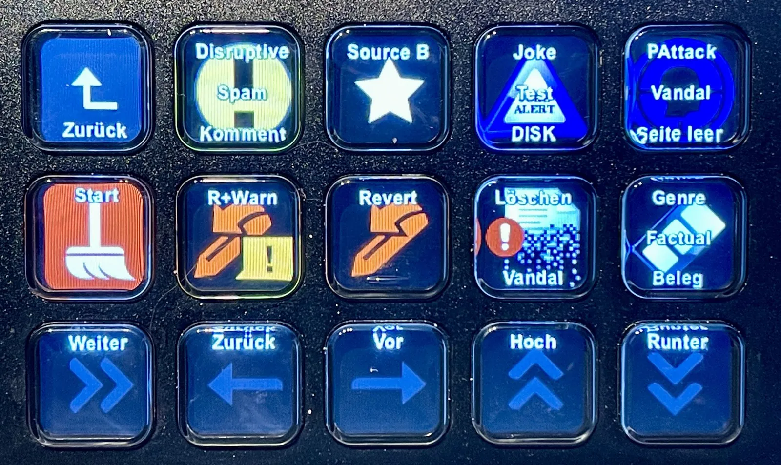
But a Stream Deck wasn't right for my dad:
- Cost. The ones with a screen behind every key cost more than a plain remote.
- Room for words. Each key's screen is small, so there's little space to say what it does.
- A cable. It plugs into a computer. Ours is the small computer behind the TV, and I didn't want a cable running across the room to his chair.
- Still something to learn. A grid of little pictures isn't self-explanatory.
Keys beside a screen, like a cash machine
So I asked AI for other ways to have a screen that changes with what you're doing, with real buttons to press. It suggested the cash machine. Older cash machines (ATMs) have keys down each side of the screen, and each key does whatever the screen says beside it. To check your balance, you press the key next to the word.
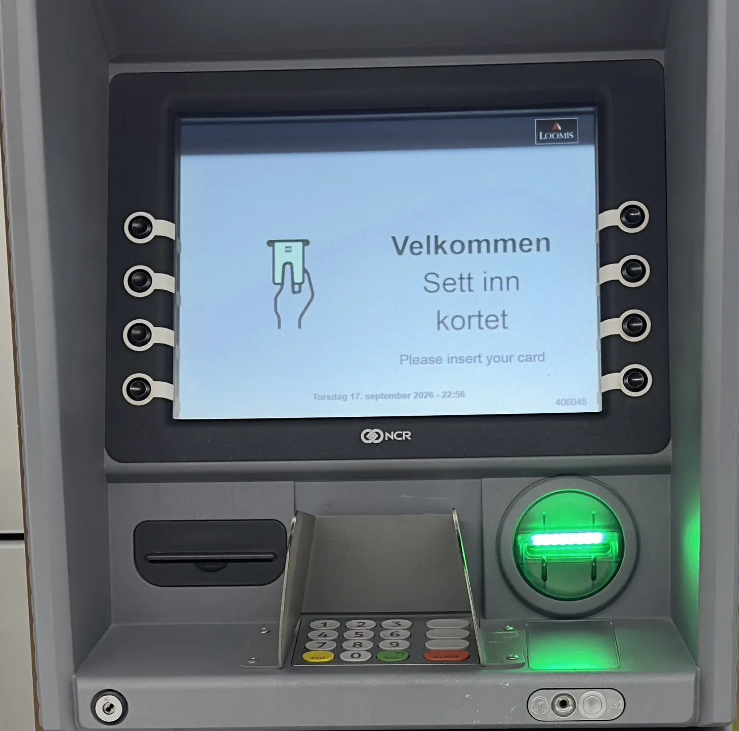
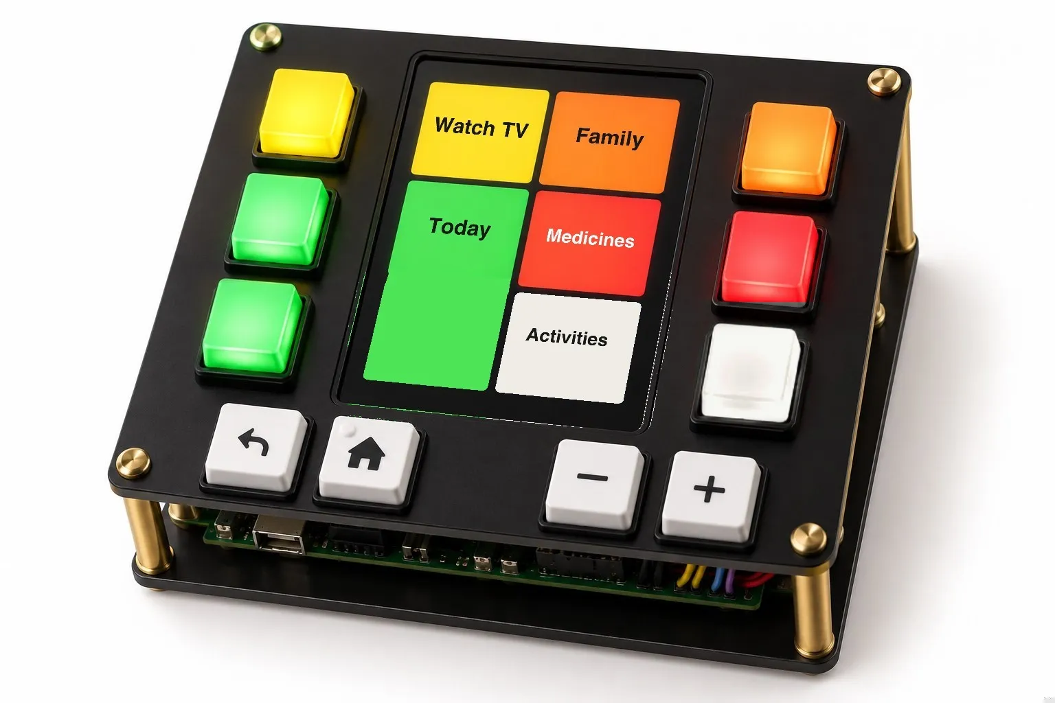
I liked the idea right away. It kept what I liked about the Stream Deck and fixed what didn't suit him: a screen that changes with whatever's on the TV, with room for words, and real buttons to make the choice. An iPad by his chair would have the screen, but no buttons to press. Our first concept put three round buttons down each side of a screen.
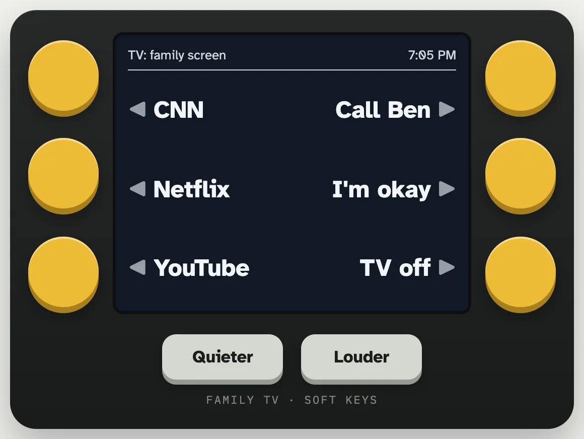
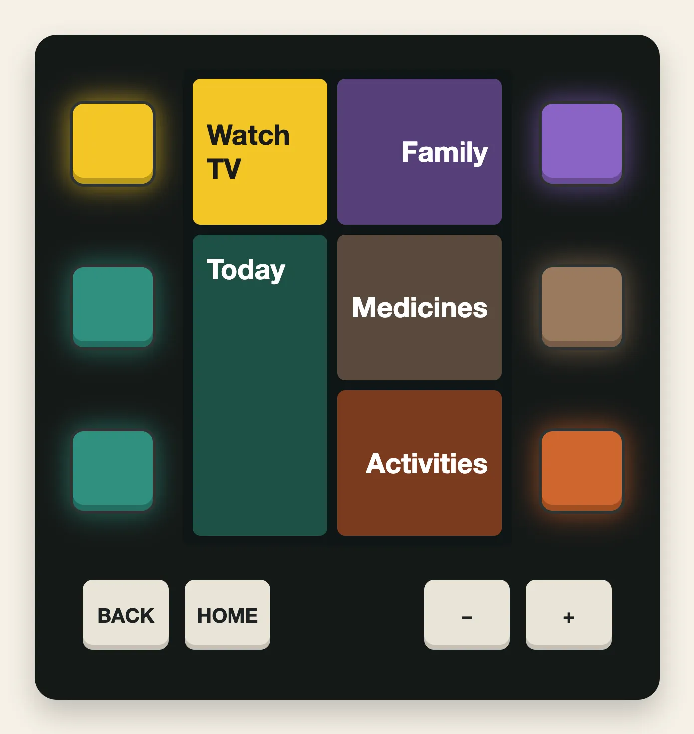
To make that work, I had to redesign our TV screens. A cash machine has three or four keys down each side, and our screens showed as many choices as they needed. So I went back through every screen and gave each one six places, in two columns of three, one for each key. The screen says what each choice is, and the key beside it picks it. One press, instead of arrow keys to get there and OK to choose, and a key he can feel under his finger.
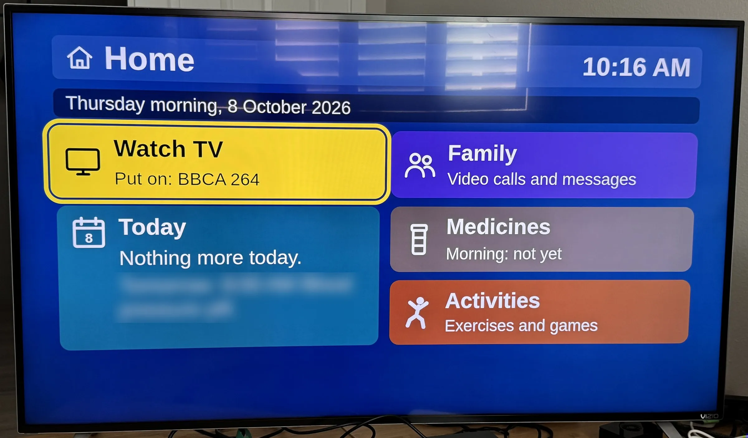
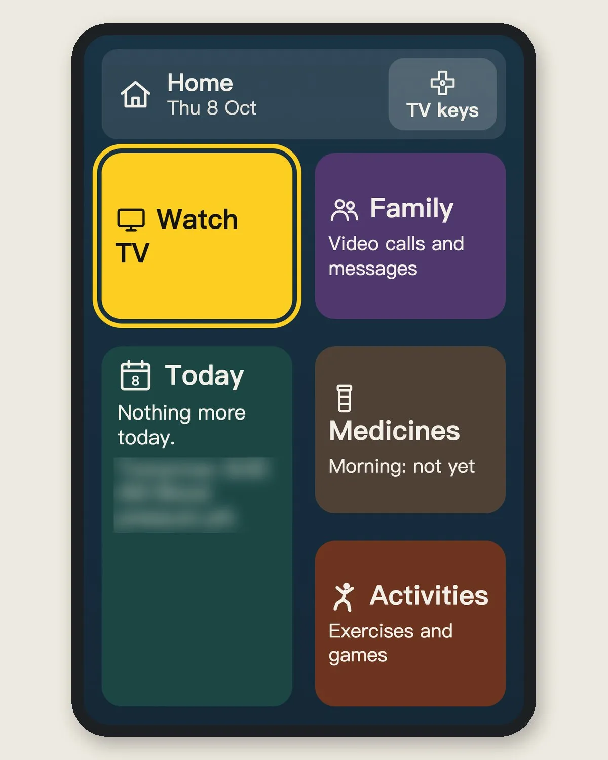
The web remote changed with it. It now shows the same six places as the TV, so whatever my dad sees on the screen, he can tap on the remote.
Could I buy one?
By then I knew what I wanted: keys beside a screen. Before building anything, I looked for one to buy. AI laid out five ways to give my dad real buttons, from his own TV remote to a box with a screen. It couldn't find anything for sale with big keys, a screen and Wi-Fi together, and neither could I.
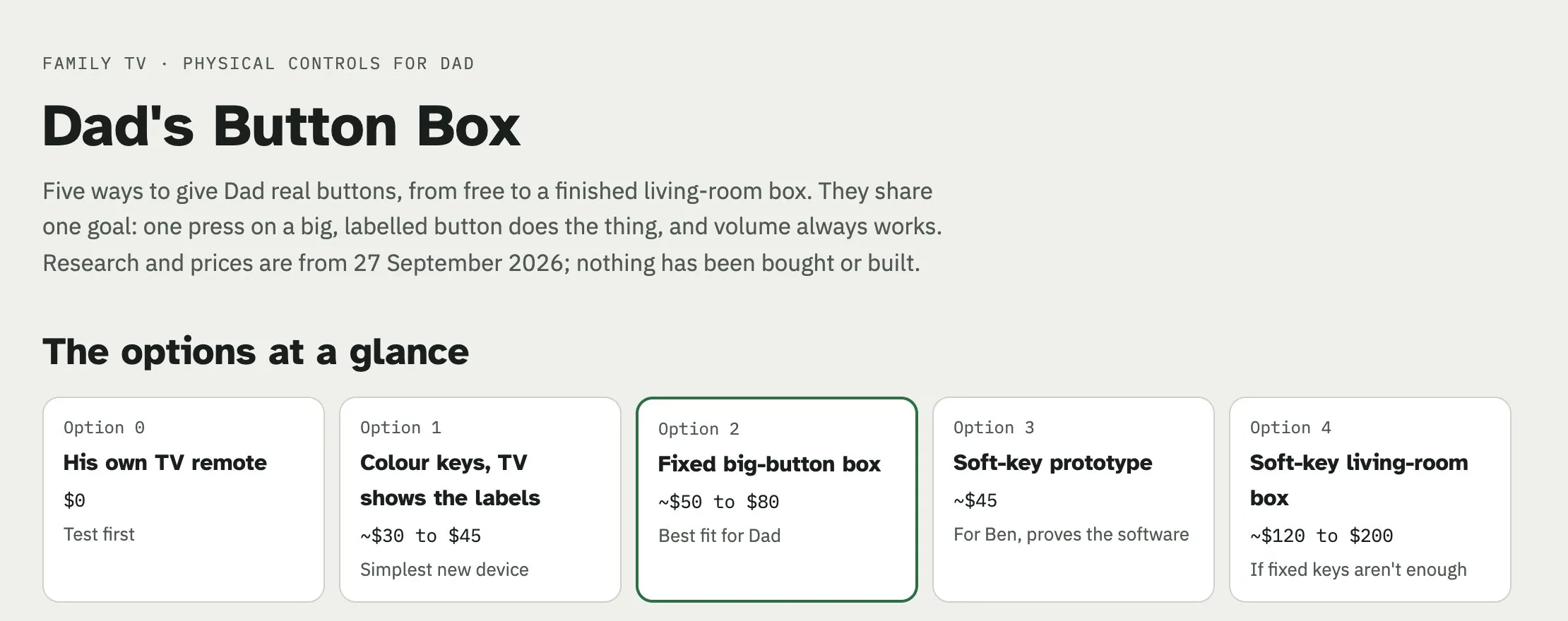
AI's own pick wasn't the screen. It was a box of big buttons that always do the same thing, because, it said, fixed positions are what stick for someone with Parkinson's. A 2007 study found something similar: older women testing phones found it hard to keep track of buttons that did different things in different places, and the researchers advised avoiding them. They also recommended a single Home button, always in the same spot.4
I kept the screen anyway, because the label sits right beside its key, in the same six places on every screen, and Back, Home and the volume never move. Whether that's enough is what my dad will show us. And since I couldn't find one to buy, I'd have to make it.
Lighting each key in its choice's colour
Making it meant deciding its shape first, and at the start that was all the designs were about: whether the screen should stand upright or lie on its side, and how big the buttons should be. I chose upright, so the three keys on each side line up with the three rows of choices. The buttons were round arcade buttons, the big ones on a game cabinet, because that's what AI suggested when I asked for practical ways to build it.
Then I found that arcade buttons can take a small light inside that changes colour. That's when it clicked: light each key in the colour of the choice beside it. Every choice on the TV already has its own colour, so when Watch TV is on the screen, the key beside it glows yellow too. He'd have the key next to the choice and the same colour on both, and when the screen changes, the colours change with it and still match.
Whether that's a big deal remains to be seen, but small things like that should add up. It does mean picking colours on the TV that are easier to tell apart. The words still come first, and a colour only ever backs up a label.
The colours also handle choices of different sizes. Some take up two places on the TV, like Today on the home screen. When that happens, both keys beside it glow the same colour, and either one opens it. He doesn't have to pick the right key, only one of them. And if a place is empty, its key goes dark.
Keyboard keys won, because I can label them myself
Arcade buttons suited the six choices, but I wasn't sure Back and Home should be the same big round buttons, sitting right under the choices where he could mix them up. So I went looking on Adafruit, an electronics shop, for something smaller and square for the bottom row, and found keyboard keys.
Then I thought: if keyboard keys work for the bottom row, why not use them everywhere?
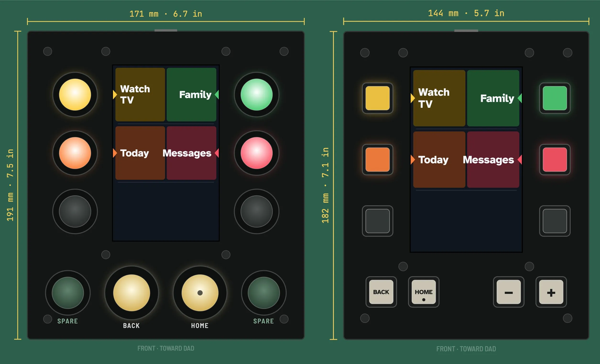
There are lit ones, so the six keys beside the screen can still glow in their colours. The four below take a clear cap with a paper label slipped inside, lit white from underneath, so I can print my own icon or word for each. Home has a raised dot he can feel, and a wider gap separates Back and Home from the volume keys. I'd also thought about a knob for the volume, but it was a whole new kind of part to wire up, when every key is the same job done ten times.
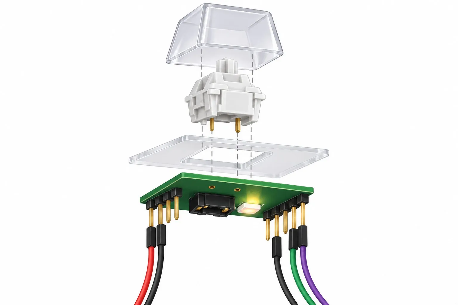
Ten lit keys might be where I overengineered it.
Because each label is a slip of paper, even the bottom keys can change their job. They're labelled Back, Home, minus and plus, for the volume, but what each key does is up to us. If my dad needs something else on one of them, I can print a new label and change what the key does. That won't happen while he's using it, only when we learn he needs something different. That's one of the advantages of building our own: we can watch how he uses it and adjust it, instead of living with buttons that only ever do one thing.
A few buttons are left off on purpose
With six keys beside the screen and four below, most of a usual remote's buttons are gone:
- No mute. It's a hidden state he could get stuck in, wondering why there's no sound.
- No channel up or down. Watch TV does that job, by showing what's on.
- No help button. Not until we see he needs one.
The plan, and what comes next
With the design settled, AI did the research for the parts, about $186 from Adafruit and Amazon in October 2026, and wrote a build guide. I haven't soldered anything since I was a teenager, so I asked for a guide a beginner could follow: fifteen steps, each with a way to check it worked before moving on.
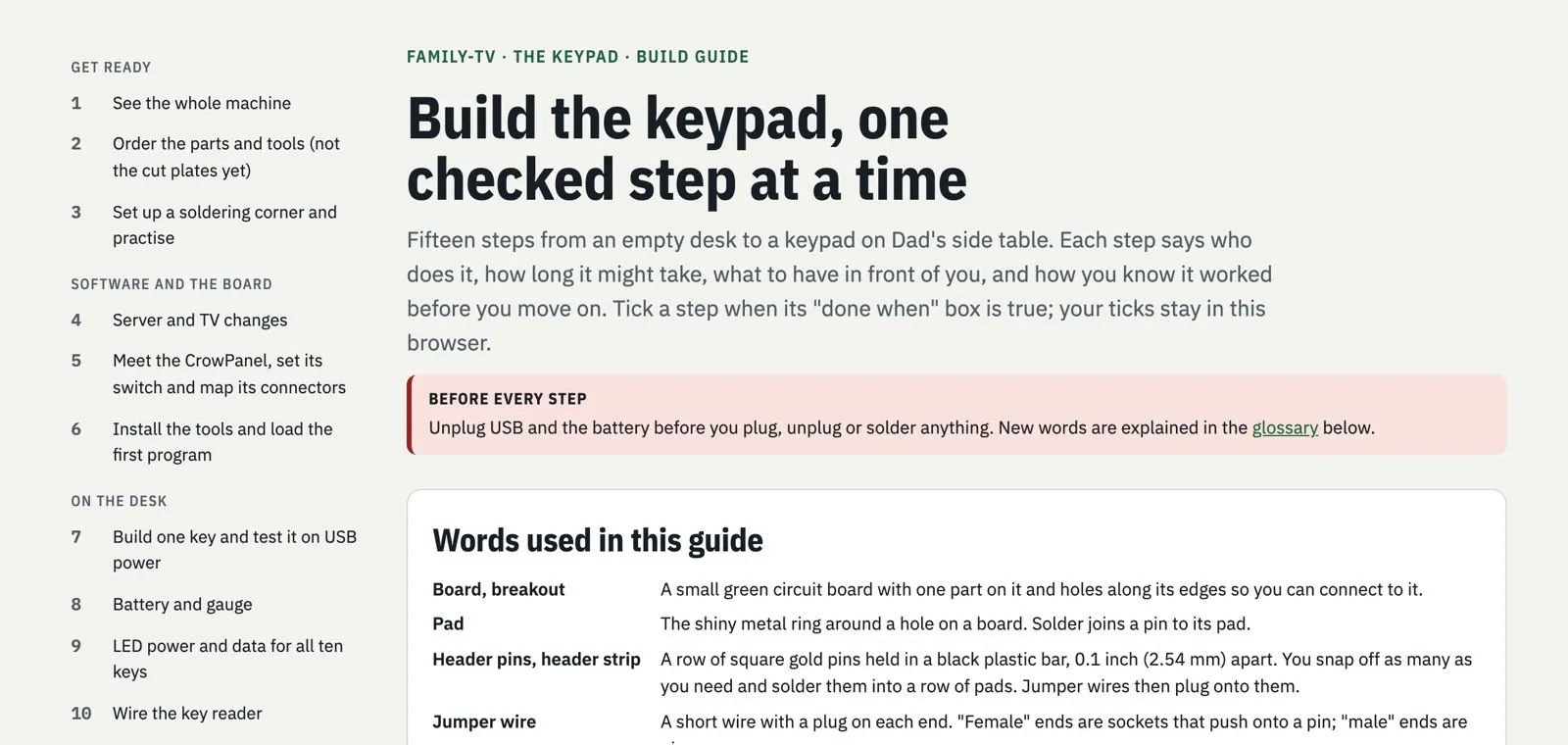
The parts arrive this week, and building it is the next post. I'm curious how different the real thing ends up from this plan. What matters most is what the plan can't tell me: whether my dad can read the screen from his chair, and whether the keys are big enough with his tremor.
If it works, he won't have to think about it. No phone to remember, no channel number. He'll press the key next to what he wants, and the TV will show it.
Follow along as it comes together, and tell us what you'd want on a remote for your parents.
Sources
- Zenith, The history of the remote control (published 2026)
- Flipper Remote, Flipper big button universal remote (published 2026)
- Ergonomics, Text entry on handheld computers by older users (published 2000)
- ACM SIGACCESS Conference on Computers and Accessibility (ASSETS), Using participatory activities with seniors to critique, build, and evaluate mobile phones (published 2007)