Stories Design note
Part of BoomerOS for TV
Designing a simple TV interface for seniors
How we're redesigning a simple TV screen and remote for my dad: each version so far, what it fixed, and why it will keep changing as he uses it.
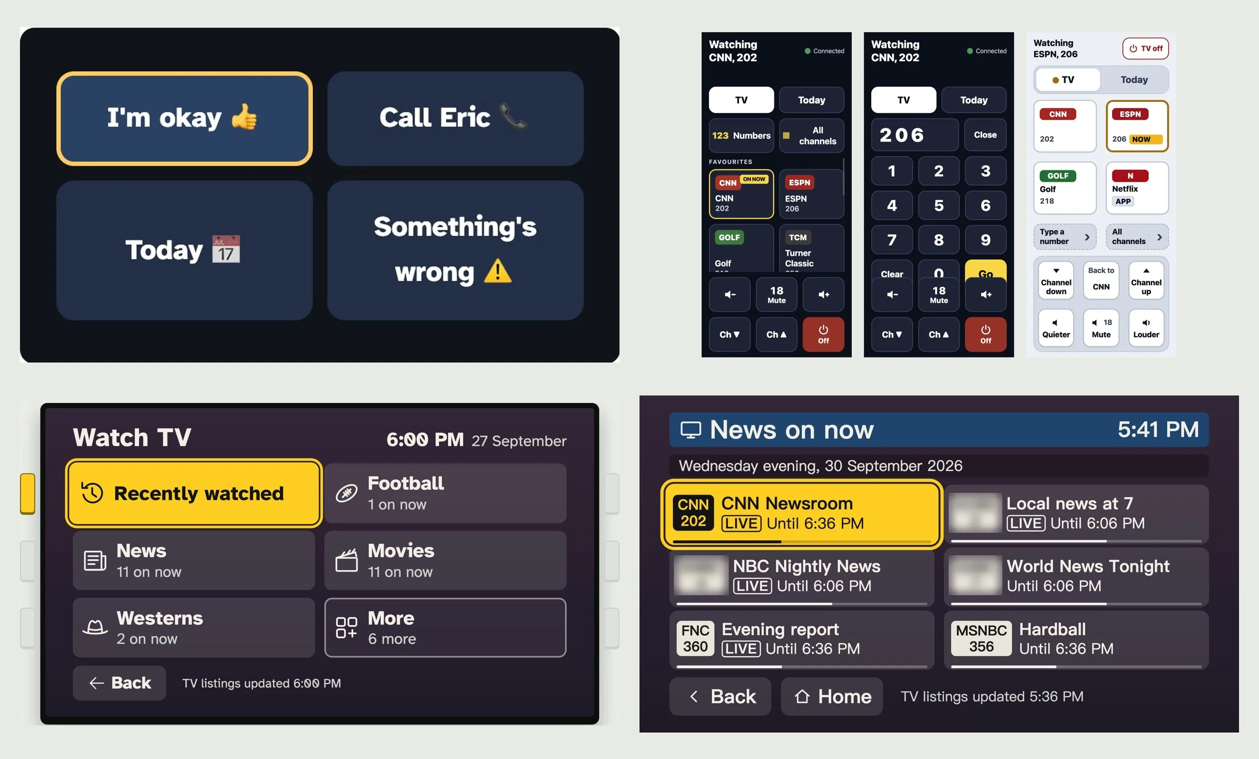
My dad finds his TV hard to use: four remotes, 340 channels, and menus where it's hard to see what's highlighted. Because of all that, my friend Eric and I are building BoomerOS for TV, a simpler screen and remote for the TVs our parents already have.
This post shows how that screen and remote have changed. In about two weeks we've redesigned them more than a dozen times. We wanted to document that process as it happens, because it isn't finished, and it will keep changing as we get feedback from my dad.
Two goals sat behind every change. My dad should never need to ask us how. And it has to work on real buttons one day, not only on a phone, because I think he'd find buttons he can feel easier. Most changes came from watching my dad with the TV he already has. Long before DirecTV, switching the TV to the right input, or remembering where the Apple TV was, could stop him. When I showed him the new DirecTV remote, I could see it was hard for him too. The rest came from trying things on my own TV, and from research. Claude, an AI assistant, helped us find studies and guidelines. We also set up AI reviewers to look at each version the way a specialist in design for older people would. Where a choice rests on research, there's a numbered note.
Eric's first screen had four big buttons
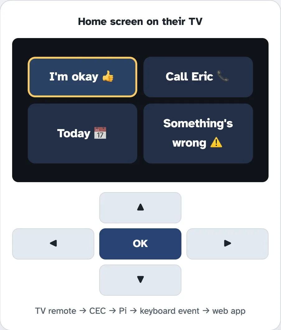
Eric started with the simplest screen that could work, built for keeping in touch. That matters: about a quarter of Americans 65 and older who live at home are socially isolated.1 His screen had four big buttons, and the remote that came with the TV moved between them.
- The goal: nothing new to learn. The TV is the screen, and the remote they already own does the pressing.
- Why it changed: Eric's parents' TCL Roku TV wouldn't pass its remote's presses on to the Pi, a Raspberry Pi, the small computer behind the TV that runs all this. Many TVs can, through HDMI-CEC, a feature that lets one remote control the devices plugged into the TV. This one doesn't. So a phone had to become the remote.
My first remote was a better version of the old one
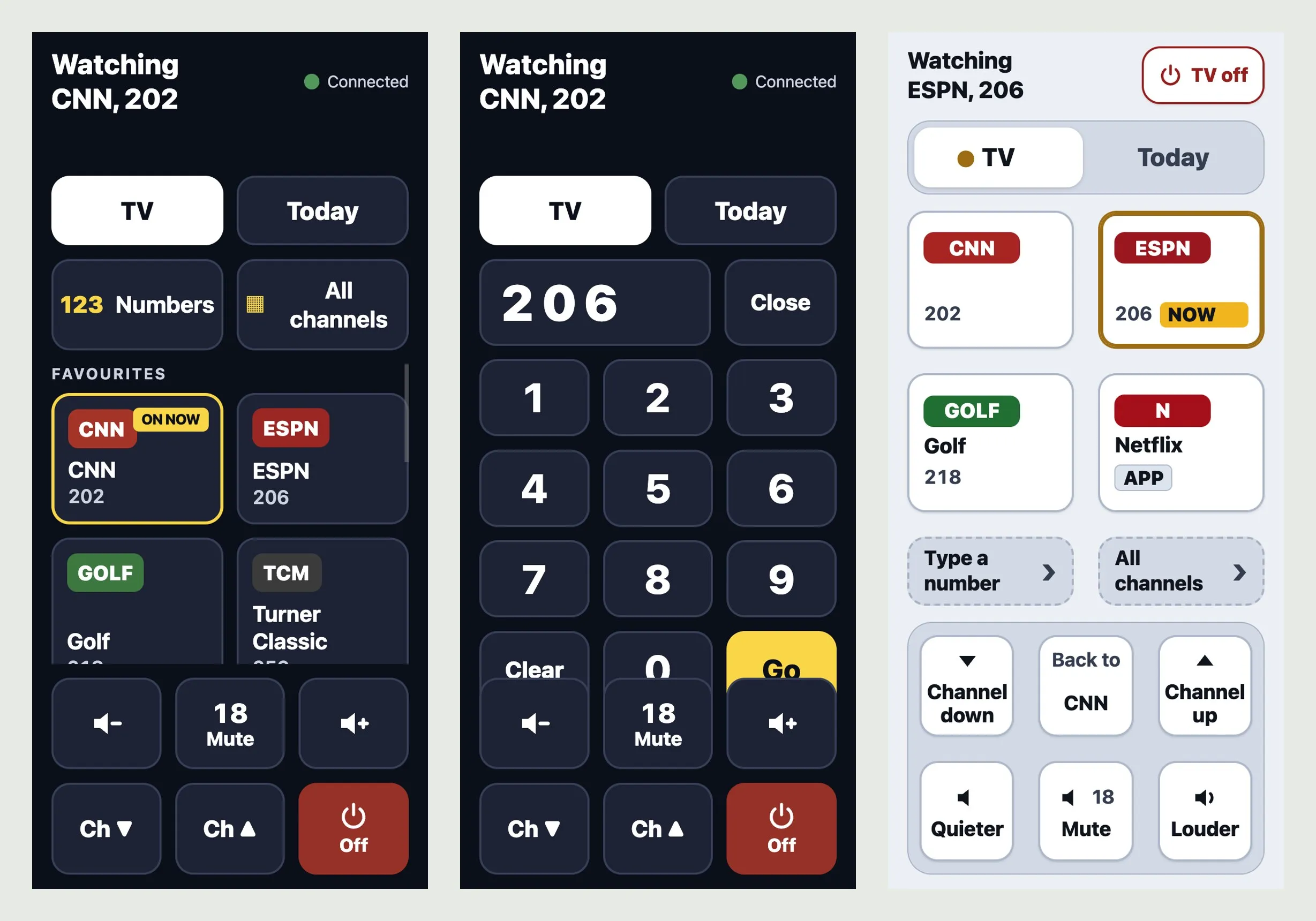
With the TV's own remote out, I built one for the phone. My first try looked like a tidier version of the remote he already had: favourite channels, a number pad, a list of every channel, channel up and down, volume and Off. I wanted it "easy to use and easy to read."
- The goal: everything my dad might need on one screen, at a size he can read and hit. My dad has mild Parkinson's. In a study of people with Parkinson's using smartphones, taps were most accurate on targets about 14 mm across,2 so we size the phone's buttons at that or bigger.
- Why it changed: I couldn't tell which parts scrolled and which stayed put. By the fourth version that night, nothing scrolled, long lists came a page at a time, and Off moved up to its own corner, away from Louder. But it still worked the old way: to get anywhere, he needed a channel number or a long list.
The home screen started following his day
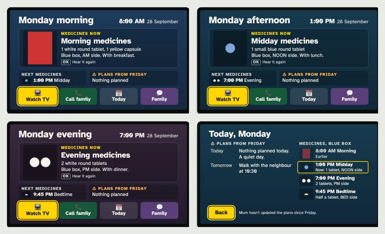
Once the remote stopped scrolling, the TV itself was still showing Eric's four buttons. My mom keeps track of my dad's appointments, medicines and vitamins, a lot of it on a paper calendar. So the next screen put the day on the TV. A big card changes with the time of day: morning medicines, a call coming up, a game that's on. Under it sat the buttons for everything else.
- The goal: one glance tells him what's happening now and what's next, without asking my mom. For medicines, that means a reminder for him, and a way for my mom to see what he needs to take and when, and maybe mark it down.
- Why it changed: I looked at an early version and wrote, "It's squished." The card and tiles each got a fixed amount of room, so nothing overlaps.
Pick what's on, not a channel number
That left watching TV itself, which still meant DirecTV's menus, where it takes my dad a while to find the highlight. He's not alone: in a 2026 study of smart TVs, older adults found it hard to use them for anything beyond plain live TV.3
Channels used to be the easy way in. Now there are hundreds, and they don't stick to one thing. ESPN isn't showing tennis all day, and the match he wants might be on a channel he'd never think to try. What he cares about is the match, not the channel. So instead of asking him to remember which channel goes with what, the screen tells him what's on.
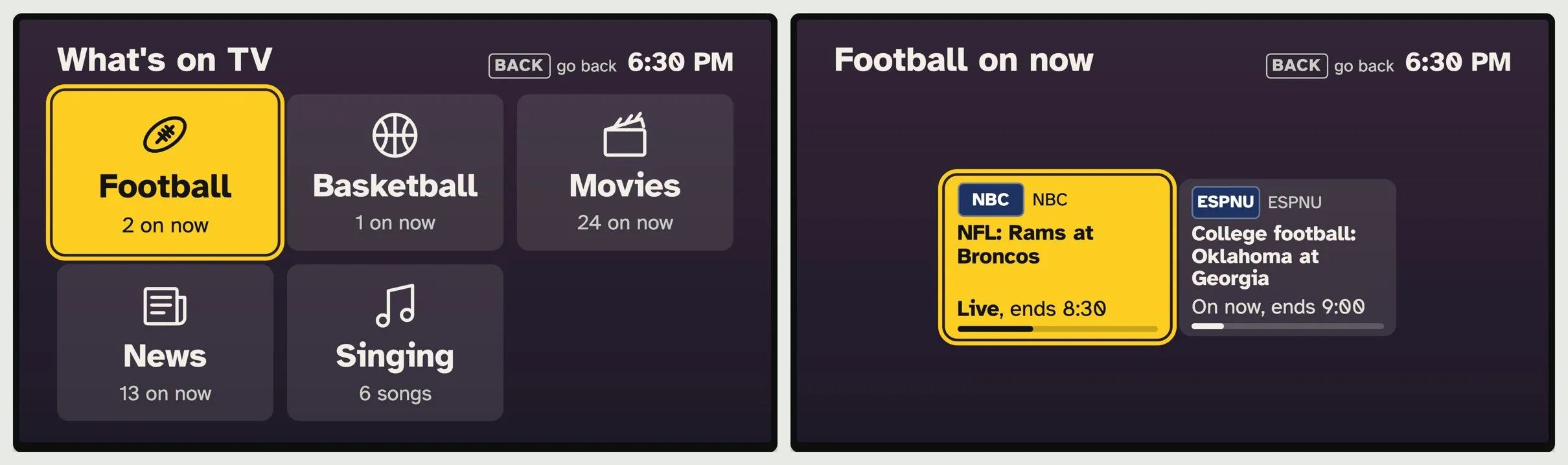
The Pi reads the TV guide for my parents' channels every 15 minutes, so it knows what is being broadcast right now. Watch TV shows a few topics, each with how many things are on. Pick Football, and he sees the actual games: Rams at Broncos on NBC, live until 8:30, or Oklahoma at Georgia on ESPNU. Pick one, and the Pi switches the TV over to the DirecTV box and types in the channel number for him. He never sees the number, and he never has to find DirecTV's highlight.
- The goal: show him the thing itself, a game or a show, so one press takes him there. I think it's easier for him to spot "Rams at Broncos" than to remember which channel it's on.
- What it took: Claude cut the 340 numbers in my parents' guide down to the channels in their package, and the listings refresh every 15 minutes.
- What it did to the remote: the phone no longer needed a number pad. Now it mirrors the TV: the same few choices, in the same places.
Three buttons that never sound alike
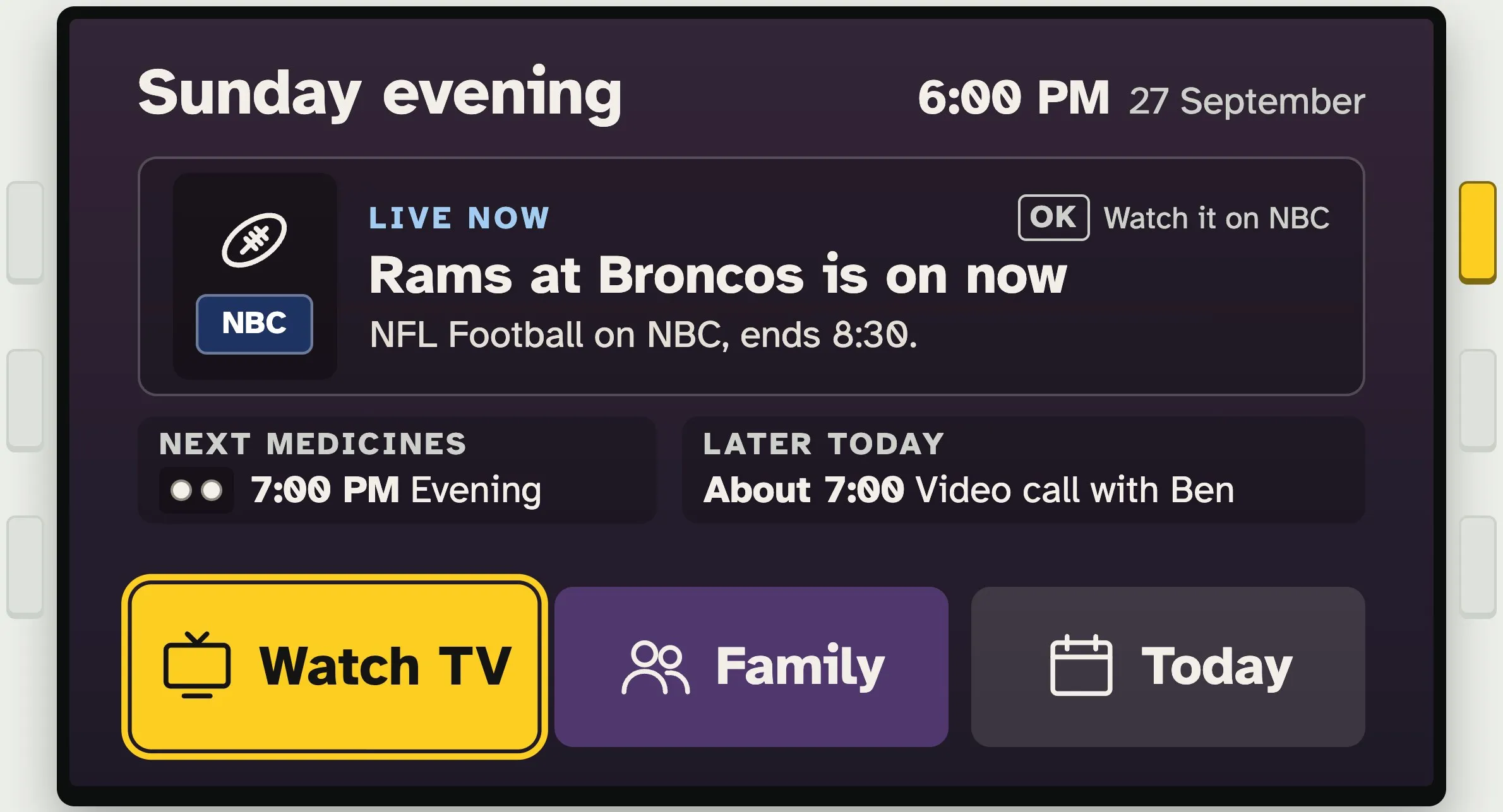
Putting the day screen and the topic screen together left five buttons on the home screen. I'd already folded "I'm okay" and "Something's wrong" into one Family button, because I wasn't sure my dad would use them. Even so, some buttons overlapped: two ways to watch TV, and "Call family" next to "Family". They seemed confusing to me, so we combined them.
- The goal: each button means one thing, and no two sound alike.
- Why it changed: two buttons that sound alike make him stop and choose. Now there are three, Watch TV, Family and Today, always in that order and in the same place. When something matters right now, like his team playing or a missed call, the big card above them says so, and one press does it.
Nine choices, and Back in eight places
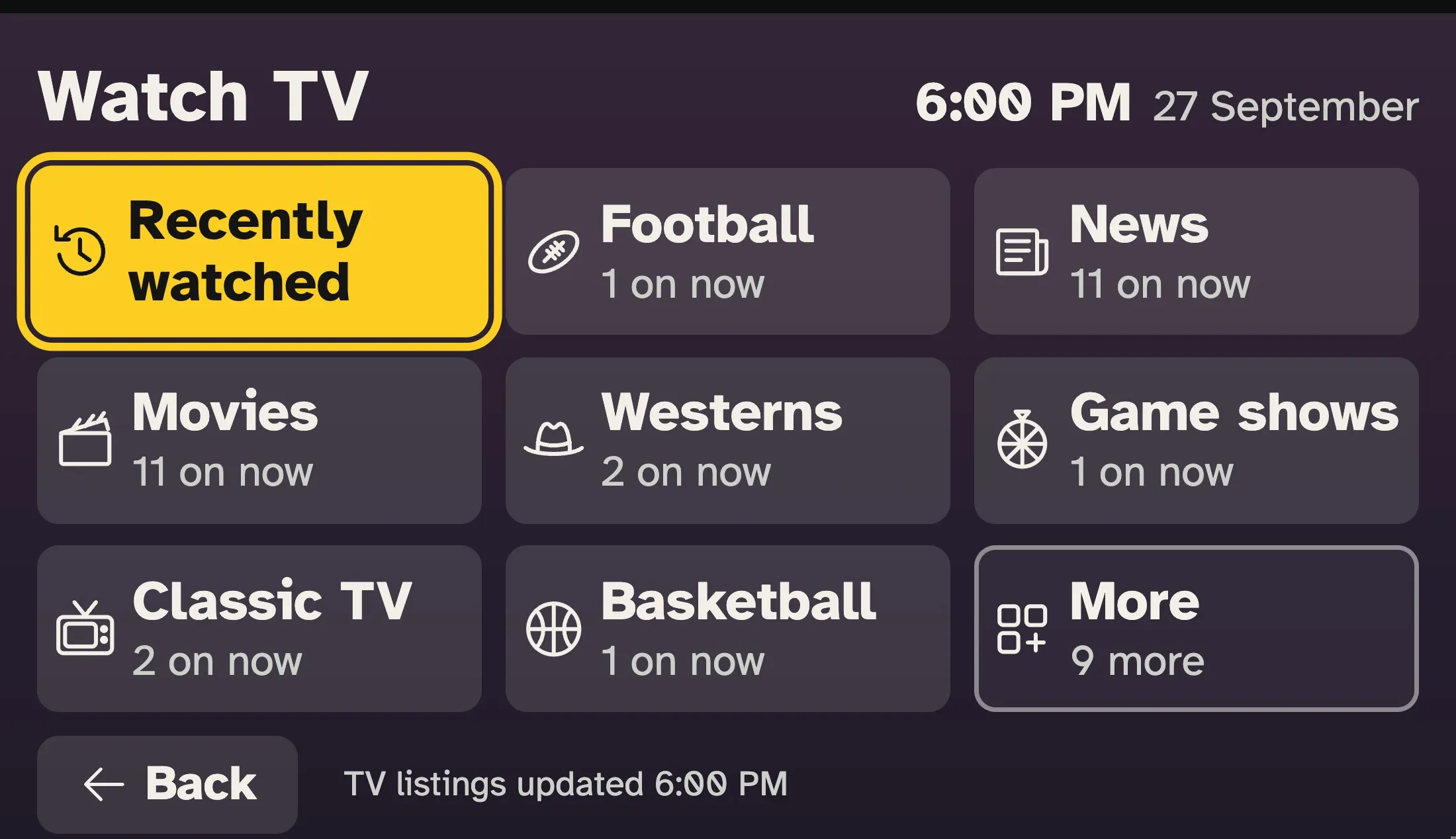
With three buttons on the home screen, more had to fit behind Watch TV. The next version put nine topics on one screen, so there was less to dig through. In a 2003 study, older people were slower at every level of a menu, and fell further behind as menus got deeper.4 Then I noticed that Back sat in a different place on Today than on Family. An AI review counted eight different places it could be.
- Why it changed: "I think we need clear and consistent locations so my dad knows what to look for." Every screen now uses one layout: the title at the top left, the time at the top right, and Back always at the bottom left. The yellow highlight looks the same everywhere and means nothing else. Accessibility guidance for people with memory and thinking difficulties asks for exactly this: common features in the same place every time.5
- Also changed: the News tile said 12 shows were on and showed 6. Now a list that doesn't fit ends in "More", with the number he can reach. And the first tile is Recently watched, so getting back to his channel is three presses of OK: Watch TV, Recently watched, his channel.
Six choices, one for each button
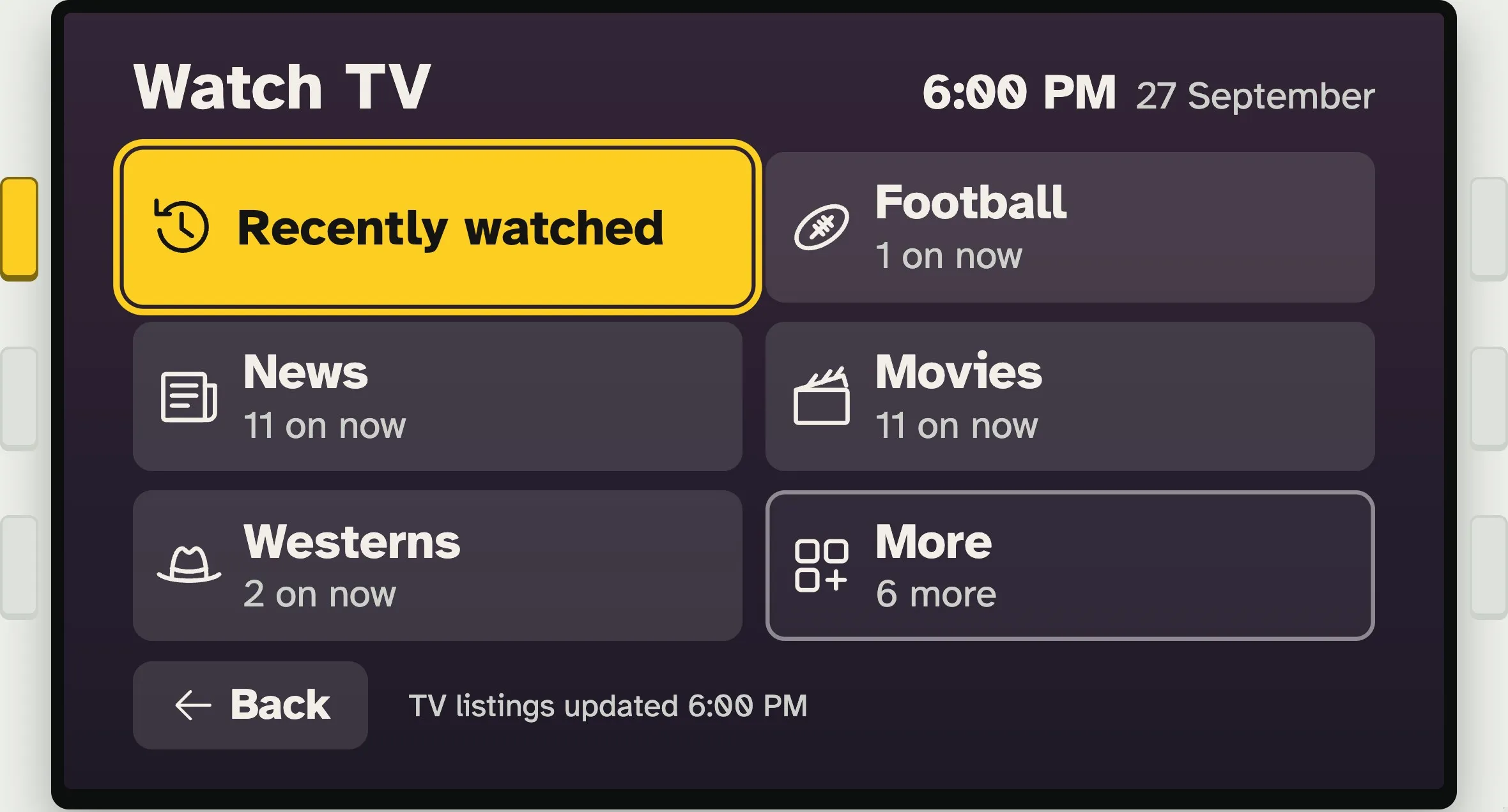
Nine was still a lot to take in, and it didn't match the button box I want to build, with three keys down each side of a small screen. So I set a limit: at most six choices on any screen, the same number everywhere.
- The goal: one press chooses. The key for a choice is the one right beside it.
- The research: older adults tend to want fewer options to choose from than younger people do.6
- The cost: more paging, which is why each family picks which topics show up first.
Trying it all in one place before my dad sees it
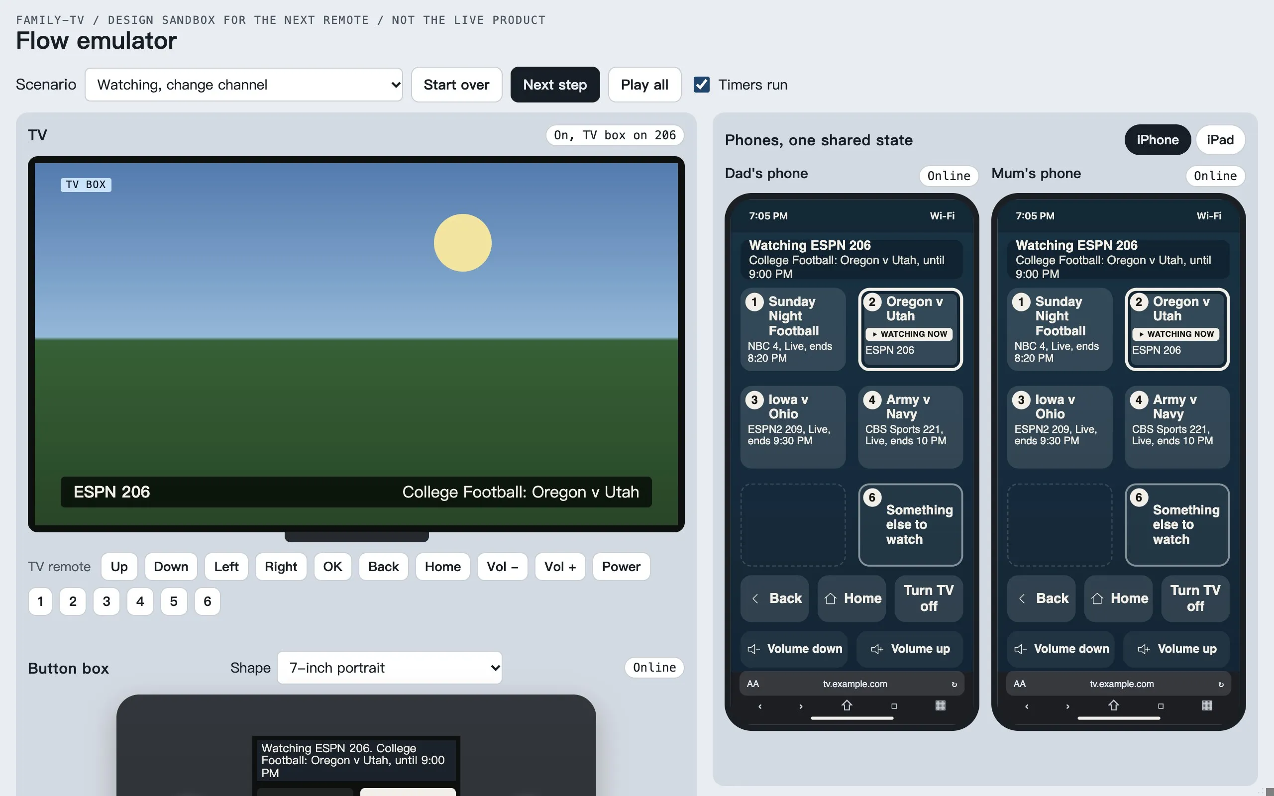
By now a choice could be pressed on the TV, on two phones, or on a box that didn't exist yet. A mockup shows only one screen at a time. So we built a flow emulator: one page that runs the TV, his phone, my mom's phone and the button box at once, all in step.
Walking through it changed a lot of small things:
- Arrow keys are tiring, so tapping a choice directly comes first.
- Looking turns the TV on. If he picks Today or Family on the phone or the button box and the TV is off, the TV comes on to show it.
- No numbers on the choices. We tried numbering them 1 to 6. It was a little confusing, and he can tap exactly what he wants anyway.
How we picture a better TV remote for seniors
Remotes made for older people are mostly the old remote with bigger buttons: power, volume, channel up and down, maybe the numbers. That made sense when you pressed channel up until you found your channel. With 340, nobody is going to press channel up until the game appears. On Reddit, someone's "grandma-proof" remote had every button taped over except the numbers, which only helps if you remember the number. Bigger buttons were never the problem. What the buttons do is. When researchers in Taiwan asked older adults, some with memory problems or early dementia, about their TV remotes, they wanted fewer buttons, bigger text and words they could press directly.7
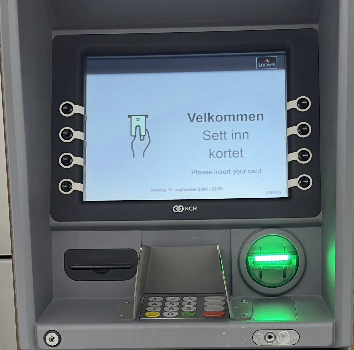
The idea for ours comes from cash machines like this one. It also comes from the Stream Deck, a box of buttons that streamers use, where each button has its own little screen. A few physical keys sit beside a screen, and the screen says what each key does right now. A 2025 review found that a remote with larger buttons may suit older adults with disabilities better than a touchscreen.8
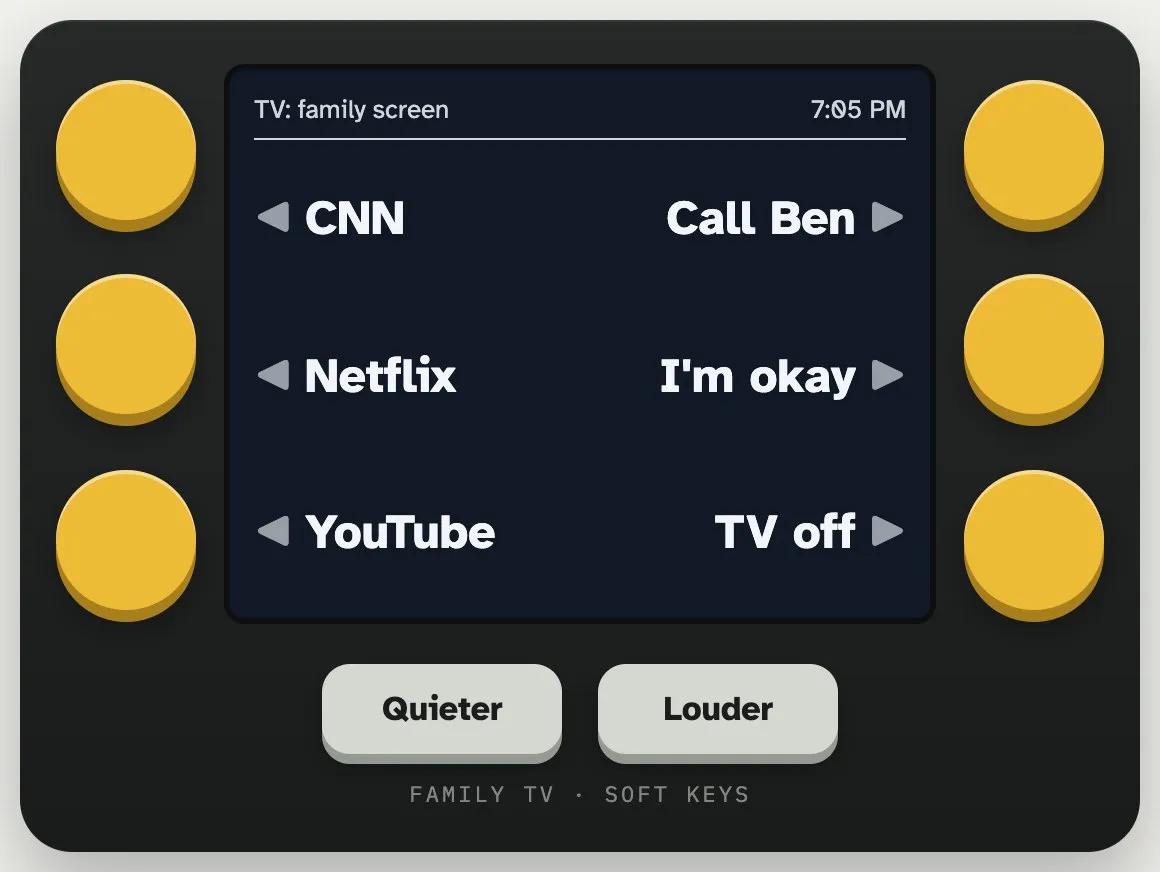
Our AI reviewer pushed back on one part: labels that change could confuse him, so it suggested keys that always do the same thing. I think the six choices should change with what he's doing, and the keys that matter everywhere, Back, Home and volume, should never move. The phone comes first, and what he does with it will decide the box. How the box is taking shape.
Cut down to what my dad will try first
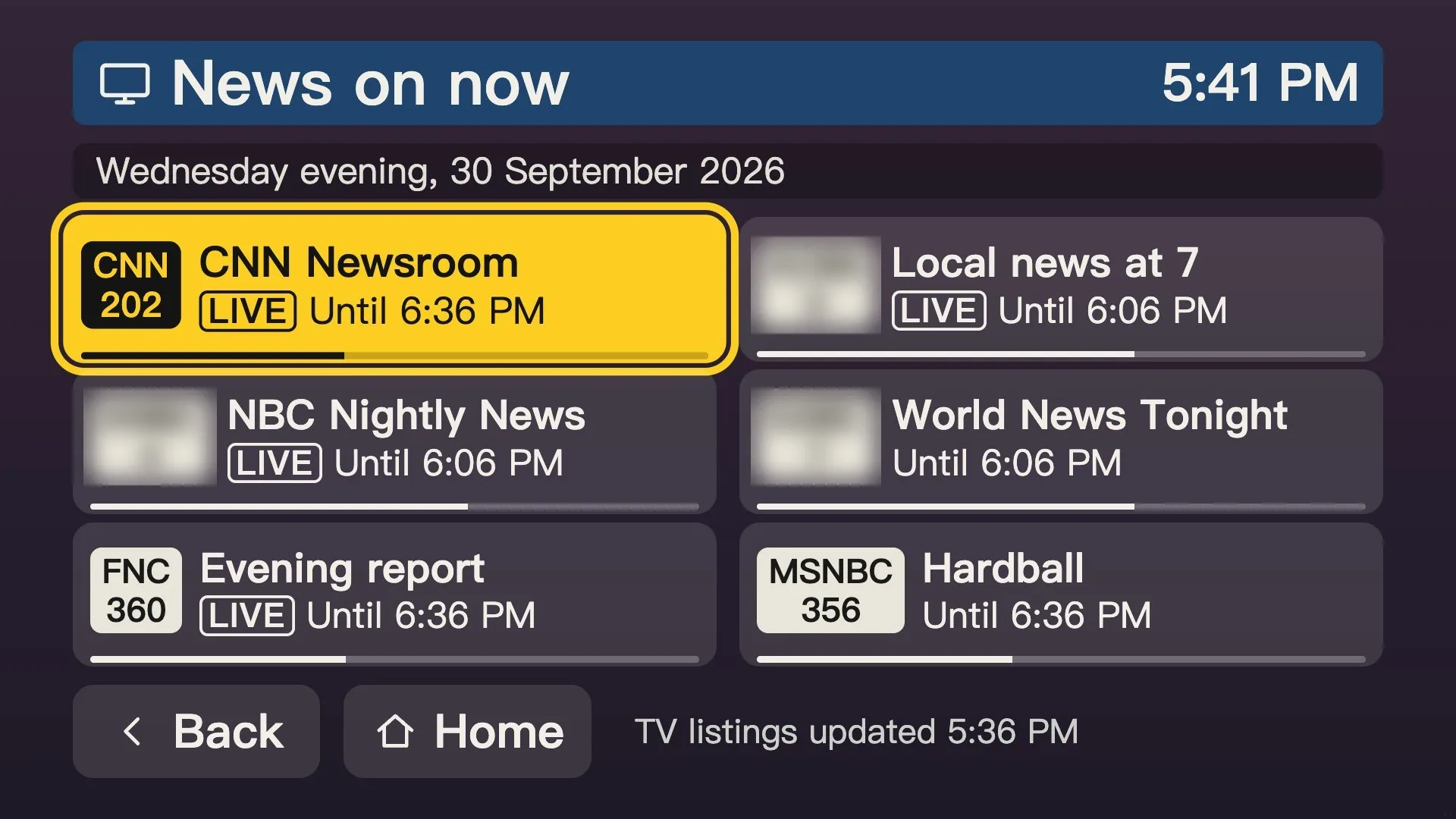
By the end of September the design had grown dozens of options, and my dad hadn't tried any of it. So we cut it to the smallest version worth testing with him:
- Three buttons on the home screen: Watch TV, Family and Today.
- At most six choices on any screen.
- Back and Home buttons always in the same spot.
One more change came from my own TV: on the home screen, the Back and Home buttons had nowhere to go, so pressing them did nothing. Now they aren't there.
A different TV for each parent
Eric's parents are on Dish Network, not DirecTV, and his mom wants different things from my dad: mostly keeping in touch with family, plus TVB, a Hong Kong channel she watches. Her screen has the same look as my dad's, with six big choices, but Eric picks what goes in each place from a settings page. Hers has a TVB button. My dad's leads with sports and news.
Underneath, both TVs run the same thing: the screens, the six places, the phone remote. What goes on top is up to each family, and a family can lay out the screen it wants today and fill it in later.
The rules we've landed on so far
- Three buttons at home: Watch TV, Family and Today, always in that order.
- At most six choices on any screen, one beside each key of the button box.
- Back and Home never move. Title at the top left, time at the top right, Back at the bottom left.
- One highlight. Yellow marks where you are and means nothing else.
- Show the thing, not the channel. Pick "Rams at Broncos", and the Pi types the number.
- Tap a choice directly. Arrow keys come second, and choices have no numbers.
- No two buttons sound alike.
- Big phone buttons, and nothing scrolls. At least 14 mm across.
Next, my dad tries it
Once the main pieces are working, the next big step is my dad trying the phone version, with a short list of things to do, like putting the news on. If he can do them without asking us, it's working. If he can't, we'll see where it stops him and change it.
So this isn't the last version. Whatever he uses, skips or gets stuck on will shape the next one, and the one after that. Each gets a new section on this page.
If your parents' TV has stopped making sense, follow along as it changes, and tell us what their TV asks of them.
Sources
- National Academies of Sciences, Engineering, and Medicine, Social isolation and loneliness in older adults: opportunities for the health care system (published 2020)
- Universal Access in the Information Society, User interface design guidelines for smartphone applications for people with Parkinson's disease (published 2016)
- Frontiers in Psychology, Evaluation of smart TV user interfaces for older adults based on the perception assessment method of analytic hierarchy process (AHP)-fuzzy theory (published 2026)
- User Interfaces for All (Springer), Age related differences and the depth vs. breadth tradeoff in hierarchical online information systems (published 2003)
- W3C, Making content usable for people with cognitive and learning disabilities (published 2021)
- Psychology and Aging, Older adults prefer less choice than young adults (published 2008)
- International Journal of Environmental Research and Public Health, Interface design for products for users with advanced age and cognitive impairment (published 2022)
- JMIR Rehabilitation and Assistive Technologies, Utilizing smart televisions as assistive technology to enhance communication and social lives of older adults: systematic review (published 2025)